
A long time ago (maybe 10 years now), I tried my hand at pixel art. I never did anything incredibly skillful or interesting, but I decided that I wanted to explore this medium again in earnest. However, I lack fundamentals everywhere, so what I'm going to address first is color theory. See, this concept of color theory is very confusing to me. So, in order to more fully understand it, let's assume nothing and build it up from there. This way, we will remove preconceived notions, and emotional bias towards colors.
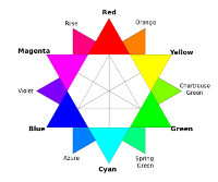
In traditional media, such as paints, we use what is known as the subtractive color wheel. To build this wheel, we start with the primary colors of red, yellow, and blue evenly separate from each other. Then, in mixing red+yellow we get orange, and red+blue we get purple, and yellow+blue we get green. These are the secondary colors. Then, mixing the primary with the secondary colors, we get the rest of the colors. Here is a helpful image to illustrate:
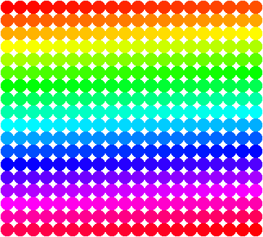
Colors on computers work a bit differently. The light is emitted at varying intensities to overlap such that the colors are produced in an additive model through the red, green, and blue primary colors. These are the primary colors because the pixel is comprised of LEDs of these colors. When taking this into account, the color wheel constructed looks like this:
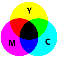
To further complicate things, printers produce physical representations of these colors, and since they are mixing pigments, they again use a subtractive color model. The primary colors of printers are cyan, magenta, and yellow. When combined, they produce secondary colors of red, green, and blue. When these are combined, they produce black. This image illustrates the idea:
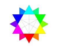
Now it turns out that red and blue can actually be created by mixing colors, so they are not truly the primary colors. The real primary colors are exactly what is used in printers, which are cyan, magenta, and yellow. When we take this into consideration, we can simply flip the star. Now the primary colors are in the correct orientation with the secondary colors (red, green, and blue) being in correct orientation as well.
This all raises a very important question when considering the concept of complementary colors (colors opposite each other on wheel) because if we use the RYB wheel, red's complement is green, but when using the RGB/CMY wheel, red's complement is cyan. So, which is it? Surely it cannot be both. Well, complementary colors will cancel each other out to produce grey, and when next to each other, they exhibit the strongest contrast to each other.
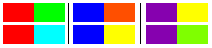
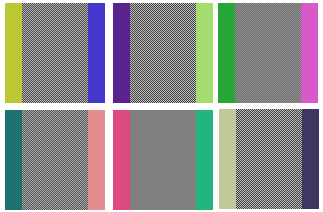
Let us first consider the combination of these complementary colors to see what is produced. In the following image, I have placed a pure color on the left and right, and the middle color was created by placing one color down at 100% opacity, and the other color down at 50% opacity. Notice that the complementary colors of the RGB color system do produce greys as required, but the traditional colors do not complement each other at all. Of course, this is on a computer through software that understands the RGB color system moreso than the RYB color system, so these results are to be expected. What is important, however, is that these are the results that can be expected in digital processes, and since pixel art is a digital medium, understanding this nuance may be significant.

Another thing to consider is the contrast between the complementary colors, as that is another requirement. What should be expected is contrast to uncomfortable levels such that these colors cannot share a boundary in the mind of the viewer.
It would appear that both pairings are difficult to look at for very long, so I would say that colors do have two complements after all. Since complementary colors have such sharp boundaries to each other, we can try to soften it a little by using a technique called dithering, where the colors are distributed into each other evenly enough to soften the transition even though only those colors were used. Remember that combining complementary colors creates grey, and we already saw that the traditional colors do not behave that way in digital processes. I also added a small section of the actual color created when canceling them out for comparison to the dithering.

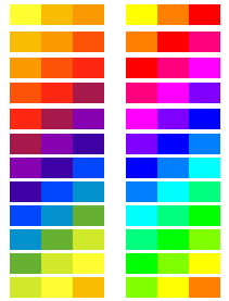
When pairing colors, painters often use what are known as analogous colors, which are three colors right next to each other on the wheel. Since we have two different wheels to work with, let us explore which wheel provides which analogous colors. In this, I took the hue directly from the wheel in question.
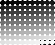
Another aspect of color is value, or how light/dark it is. If we remove hue from the equation, we can create a scale of value from 0 to 98. I omitted 99 and 100 because they are just white at that point. Also, there are 11 values per row instead of a possibly more logical 10. I did this because I noticed significant changes every 12 values, but in retrospect that might have been my imagination. At any rate, this is the result:
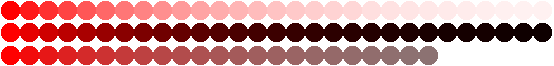
With value explored, we can now take a hue, and generate tints (adding white), shades (adding black), and tones (adding grey) by placing a color down at 100% opacity, and then setting color to (white | black | grey) at 10% opacity (with grey at (127,127,127) or 50 value), and clicking over it. Here is red (255, 0, 0) with tints, shades, and tones in order. One thing of interest is that the tones cut off more abruptly than the tints and shades. In fact, the tints and shades could have been extended even further, but I think this is enough to get an idea of how this works. Each blot increases by 1 click.
Maybe this will create a robust palette if all iterations were accounted for, but pixel art prides itself on palette economy, so the idea is to do more with less. One technique that has been utilized is something known as hue shifting. This is accomplished by establishing a base color, and then adding a value,hue change to each successive color. This can end up creating either skittles or very nice transitions that attempt to mimic the way light plays on objects in real life. We will establish a base red by setting rgb(255,0,0) with a value of 50 and a saturation of 50. The central color has a square cut out of it for reference. This is a hue shift from end to end by adding 10 to hue and value to increase exposure and subtracting 10 from hue and value to decrease exposure. Here is the result:

This is an interesting method, and it clearly creates a robust palette. However, perhaps we can hue shift another way. Again, taking the same hue, but this time I took orange (255, 79, 0), which is international orange, and setting opacity to 10%, I hue shifted up. Similarly, I took rose (255, 0, 127), which is rose, and shifted down. Here is the result:

This is clearly not going to create a diverse palette. So, I consider this experiment unsuccessful.
Another thing to consider with regards to hue shifting would be to directly shift using yellow (255,255,0) for lights, and blue (0,0,255) for darks. So, in trying that (with the same red as base), this is the result:

Now, I would say that this technique might be worth exploring further because this seems to be how light and shadow would work with regards to this initial color. When I become a better pixel artist, this might look more impressive, but for now, enjoy a picture of a ball:

After a bit of pondering, I figured that maybe the transitions favored yellow a bit too much, so I went back and modified the palette such that yellow drops saturation to 40, and blue drops value to 40 becasue less saturation whitens the color and less value darkens it. Here is the updated ball picture:

So, now that we understand that color is comprised of three components (hue, saturation, value), we can begin to attempt to analyze images by segregating these various components to see what can be learned. For this first study, I have selected this image of an orange on a tree:
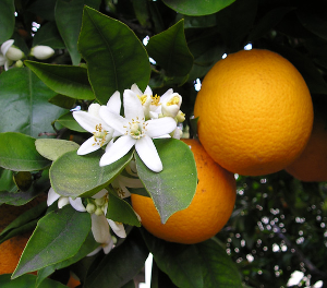
To keep things simple, we will just analyze the various colors of the orange. Since there are shadows, highlights, and neutral areas, this is a nice piece to look into. I begin by color picking the few areas of interest. This is the palette that I have decided to look at:

With the palette, we then color pick each color, and set value and saturation to 100, which is the first row. Then, we again color pick and set only value to 100. This is the second row. Finally, we set both hue and saturation to 0 to see pure values. This is the third row.

Two interesting things to note are 1. the shadow is red. 2. The saturation is pretty high all throughout. While this particular effort did not yield much data, analysis of actual sprites with appealing use of color should shed some light on their decisions. As it stands, these colors would (probably) not contrast well enough with each other to communicate any meaningful detail in a pixel art sprite.
I became curious about the various hues available, so I created this image which is every hue in single increments at 100 value and 100 saturation. I want to mention something here to anyone who is reading this. If you are interested in color at all, this is a very enjoyable exercise. Yes, it is boring to go through every hue, but being able to see the gradual shifting from one hue to the next is quite elucidating. I just threw on some music, and went at it. I highly recommend you do it too, because while I may be giving you the image, you did nothing to get it. So, you probably cannot appreciate each of the hues like I can. I painstakingly placed each one. Trust me... this is an experience-for-yourself thing.
In this next experiment, I wanted to see how saturation and value interplay. So, the following image takes this base hue of 200, and starting at 100 saturation and zero value, it works by subtracting 1 from saturation, and adding 1 to value for each blot. Here are the results:
Going back to the idea of complementary colors, to identify the complementary color of any color in question, take its hexadecimal value, and subtract it from FFFFFF which is the hexadecimal value of white. What this does is create a color that when dithered together will produce grey because they full cancel out. Initially, I figured that I would be able to utilize this technique to produce any value that I wanted, but the tests have shown that the color produced is quite different from the original color, so I believe it has something to do with the overflow features of RGB, which I will discuss soon. Unfortunately, there are a lot of idiosyncracies about the color coding to overcome. Anyway, to illustrate this point, the random chosen color is on the left, and the resultant color is produced from subtracting the original from white. If this exploration has interested you at all, I encourage you to do a few of your own for fun. Anyway, here are the results of the experiment:
Just understand that light is not paint, so some hues will dominate others more completely. The strength in this would be low saturation colors almost certainly. This way the strong saturated colors cannot push through the grey.
A common exercise in art is to create a silhouette of a subject, and then once the shape is complete, you fill in the details. Well, I tried that with a Mortal Kombat I sprite of Scorpion. Here is the result:

Personally, I think he turned out awesome.